Magazine Photo Shot and Sketches
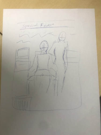
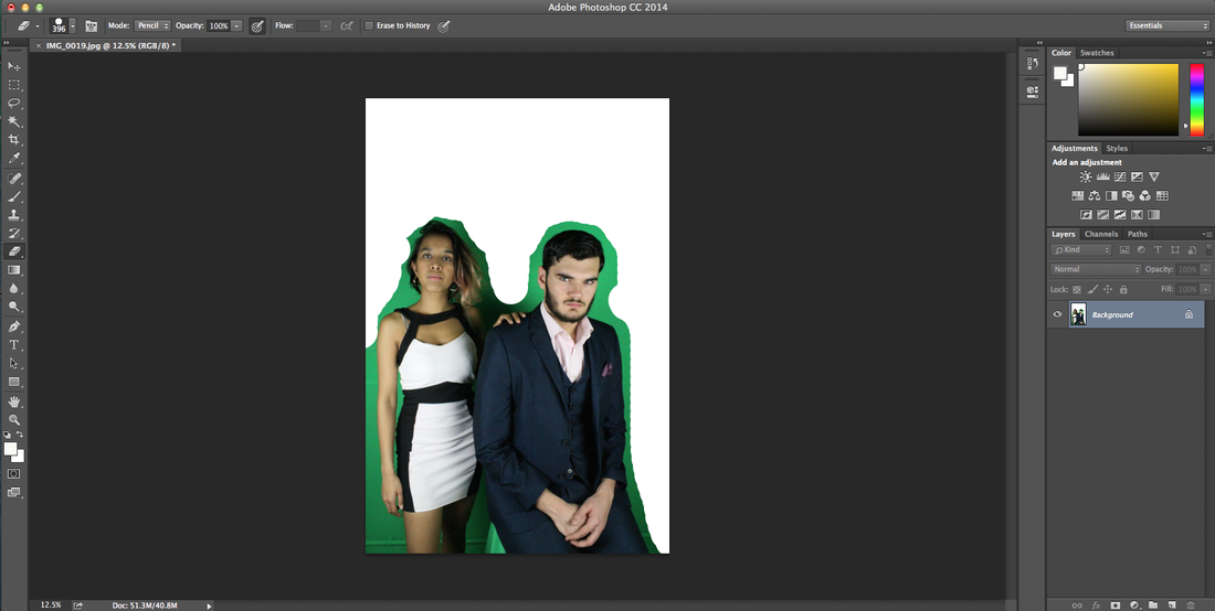
This is the original sketch and idea for my magazine cover. i wanted Jeremy to be sitting down while Veronica is standing by him with a dominant pose to show she is in power.
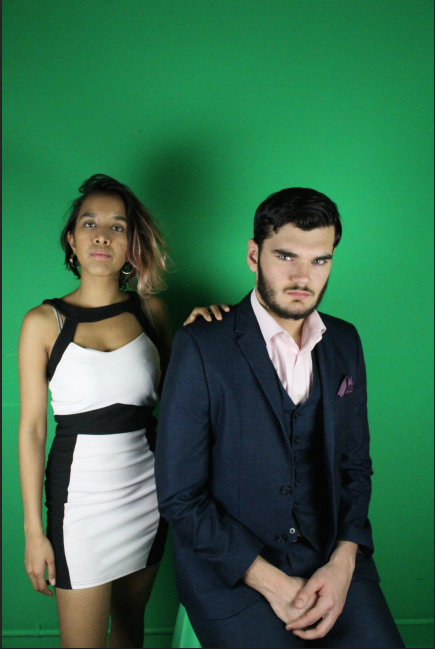
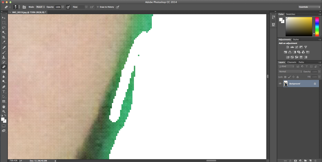
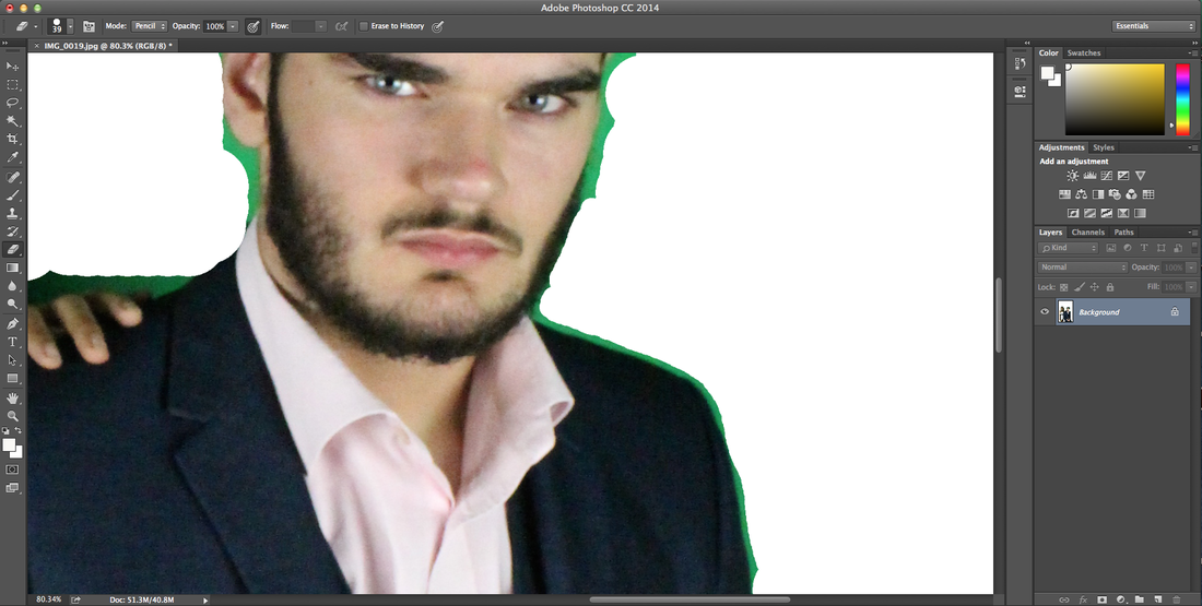
Editing and First draft
|
|
|
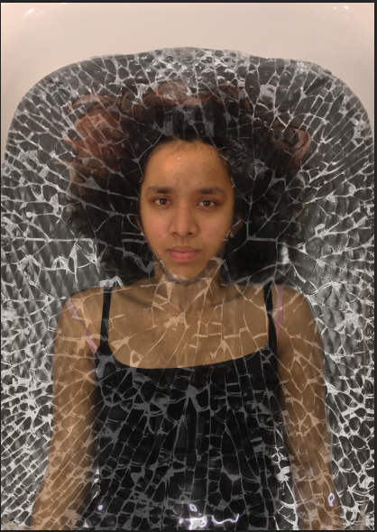
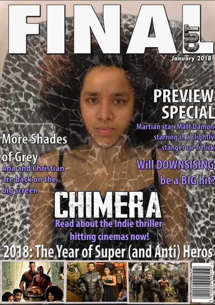
We took several pictures of Yuden in her bathroom, both under the water completely and with her face over the surface, but a lot of the pictures weren't too good. We had wanted to make the water black with a bath bomb, but the colour was bad and there were bubbles everywhere. I started editing one picture of Yuden completely submerged, but the problem with that was her eyes were closed under the water, which was weird for a poster as the whole point is to show off the main characters- for example in Avengers posters and magazine covers, the heroes have their masks off and helmets off to show the actors, many of whom will have a previous fan base. All the pictures of Yuden with her face above the water turned out looking really weird, so I tried to edit her face over the top of this one. It took a while, as I had to get the colour correction right so that her face matched her body, then I had to get it in the right place. I also had to make sure her hair and hair line matched and went into each other as seamlessly as possible, which was difficult as you could tell pretty obviously where one picture started and the other ended.
One way I overcame this was adding to the water a shattered glass effect. Some of the water was over her face, so I could put the glass over it and it lessened the obviousness of the two pictures. The reason I chose to do this was actually due to the amount of broken glass/ mirrors we are using both in our trailer and other posters/ magazines. It links really nicely, and makes the image look more exciting, as well as creepy, which I think the face also does, as there is something uncomfortable about the way Yuden is looking directly at the audience. |
|
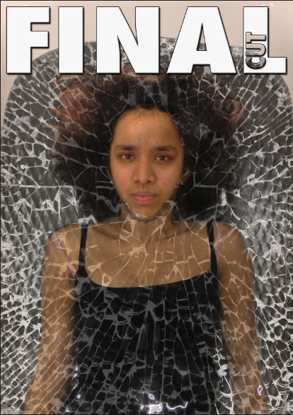
For the magazine title, I had this idea of calling it final cut, and have the latter word cut out of the former. I wasn't sure how to do this, so I found the video above, which taught me. I then added a drop shadow and stroke to make it more prominent and bold. The only thing I couldn't do, which most magazine have, is Yuden's head over the title, as she is submerged in the water. This doesn't matter too much, as her head is too low anyway, and there is enough space above it to fit the title in.
|
|
|
|
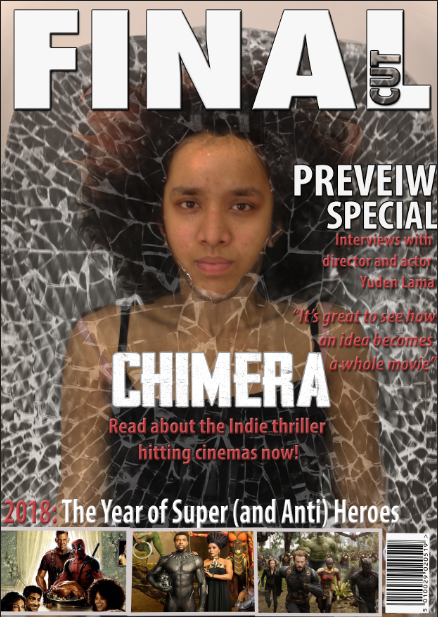
For the cover lines, I tried to fine movies that were coming out soon or already out to advertise and I came across a load of superhero movies, so I thought it might make a nice theme to have at the bottom. I took promotional picture from the movies and added them at the bottom, with the caption '2018:the year of the super and anti heroes' as Deadpool is also involved and he is an antihero. I then added the title of our movie with a caption 'read about the indie thriller...' as people aren't going to know our movie, we have to introduce it to potential audiences.
|
I needed to add different cover lines as I didn't have enough and they were all to do with my movie. I added in a bit about the new fifty shades movie and Downsising, a movie that's come out recently. I had to try and make the cover lines stand out more, so I added a bevel and a thicker stroke and a different colour, but I think the colour could still change. I just can't find one that fits well. As for everything else, I misspelled heroes, so I need to change that, and I added a date under the title, but everything else seems pretty much fine.
|
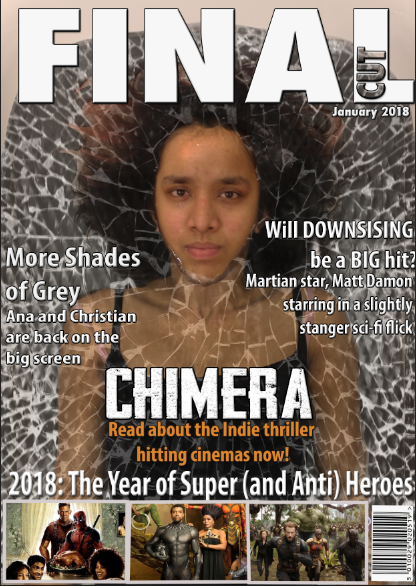
Final Magazine
|

|
