Poster Planning
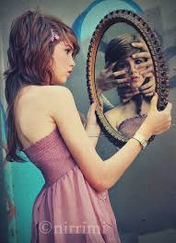
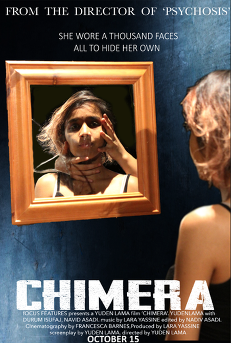
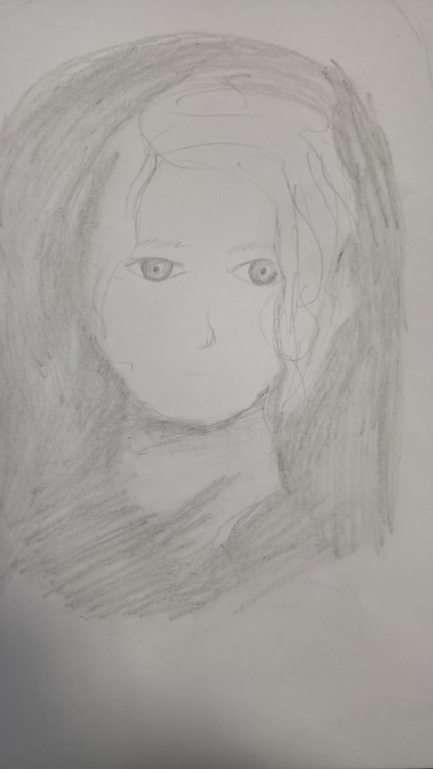
For our poster planning we thought of this idea to have Veronica looking at herself in a hand held mirror but when you look at her reflection you see hands around her neck and face holding onto her. We thought that this looked creepy and represented her mind very well as she feels that she is perfectly normal when you look at the mirror which shows her 'true' self you see these mysterious hands. Could represent a dark past or something/someone holding her back or haunting her.
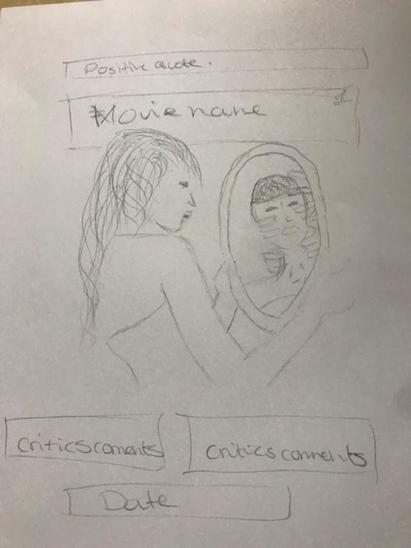
I incorporated some of the techniques that i discovered through my poster research into this rough sketch. For example, adding critics comments and positive quotes to create a good image of the movie, show the audience that people have enjoyed it and create a buzz around the movie. All to draw in an audience and get people to watch.
I incorporated some of the techniques that i discovered through my poster research into this rough sketch. For example, adding critics comments and positive quotes to create a good image of the movie, show the audience that people have enjoyed it and create a buzz around the movie. All to draw in an audience and get people to watch.
These sketches are ideas for our magazines and posters. The first, we had an idea, taken from our trailer where our protagonist sinks into the bath. We thought it would be really cool if we got a picture of her under the water with her eyes open. This would be really creepy, and give an idea to the audience that she is not totally sane. Also, having her eyes open makes it really uncomfortable for someone to look at as it is uncomfortable to open your eyes under the water. In addition, another idea that we could do is make the water black, either with a bath bomb or food colouring, then have Yuden's face coming out of the water, it would look really creepy.
|
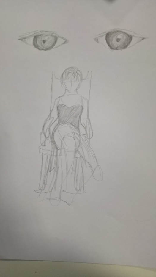
This idea is to have our protagonist sitting on a chair, then having her boyfriend's eyes behind her. We want her to be wearing a formal dress with a hard expression on her face, perhaps showing how ruthless and cold she is, while her boyfriend could look more worried. The problems with this one is that we can't get a really nice chair like we wanted into the green room, so we'll have to photoshop one in, and that may take away from the real look of it. Also, it could give off the wrong idea to the audience, of the protagonist being watched by someone, which isn't what our movie is about. We want to convey that she is in control but that may not come across with this picture.
|
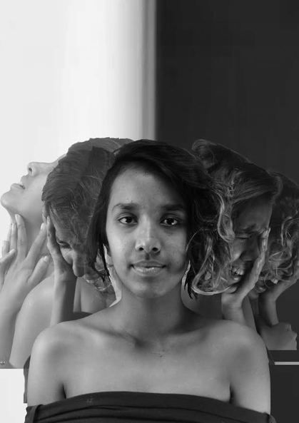
This is a practice for one of the posters. I tried it with some photos we took that weren't that good, but good enough for me to get a basic idea of what I want and what I'm going to do. I want to get it so that we have one main picture of Yuden at the front, then her different emotions all behind her, fading away. The problem with this one is that the pictures were only good from a point upwards, so you can see where I've cut them off and it looks really weird. I was thinking of putting something like broken glass or the title there so you don't see that, but as it is just a practice, I think it looks ok. I chose the background as a link to our inspiration, which is Get Out. That's also why I chose to have it in black and white as well as the face that it was impossible to remove all the green from the green screen behind her. I think it looks good, but we need to take better pictures.
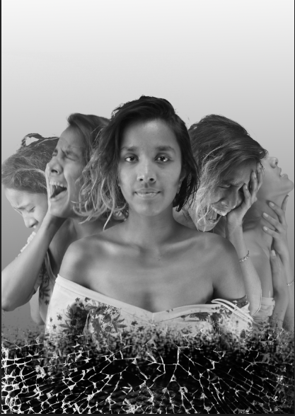
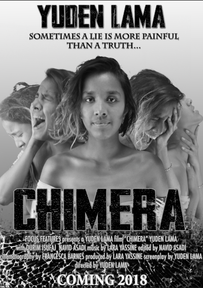
This is the starting of my poster with the proper pictures. I used the burn tool a lot to make Yuden look more sickly, bringing out her collar bones, neck and ribs a little more just to make her look thinner, as we tried to do that with make-up but it didn't show very well on the pictures. I also changed the background as it we didn't like how the two different colours made some of the other pictures darker, while the ones on the other side remained light. It looked a little strange, so I tried a gradient background, which does look better. I've added the broken glass, which is something we want to have as a theme in our posters and magazines. I used the eraser tool with different shapes to make Yuden fade into the glass, as though she is breaking, fragile.
|
|
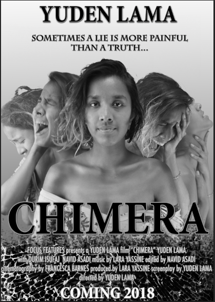
I was trying out two different fonts for the title. One that was pretty simple, which I made a little more prominent by adding strokes and drop shadows. This brought it out from the black and white pictures or else it got lost. We also decided on this tagline 'Sometimes a lie is more painful than a truth' which creates intrigue for people who view it. However, I prefer the second font, which is called 'Awakening.' It looks a lot more creepy and broken, much like the glass, and it's a lot thicker, meaning it stands out more. I made the billing block, actor name and the tagline more prominent by adding drop shadows.